Overview
Redesigned a complex B2B SaaS platform for a property management software company.
The Challenge
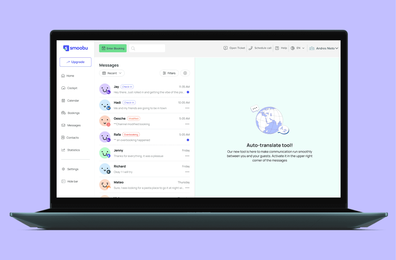
SMOOBU's interface was designed by engineers, and despite powerful features, the app was perceived as difficult to use.
Balancing the features complexity and the simplicity of use. The goal was to offer a complete property management software without overwhelming users.
What I did
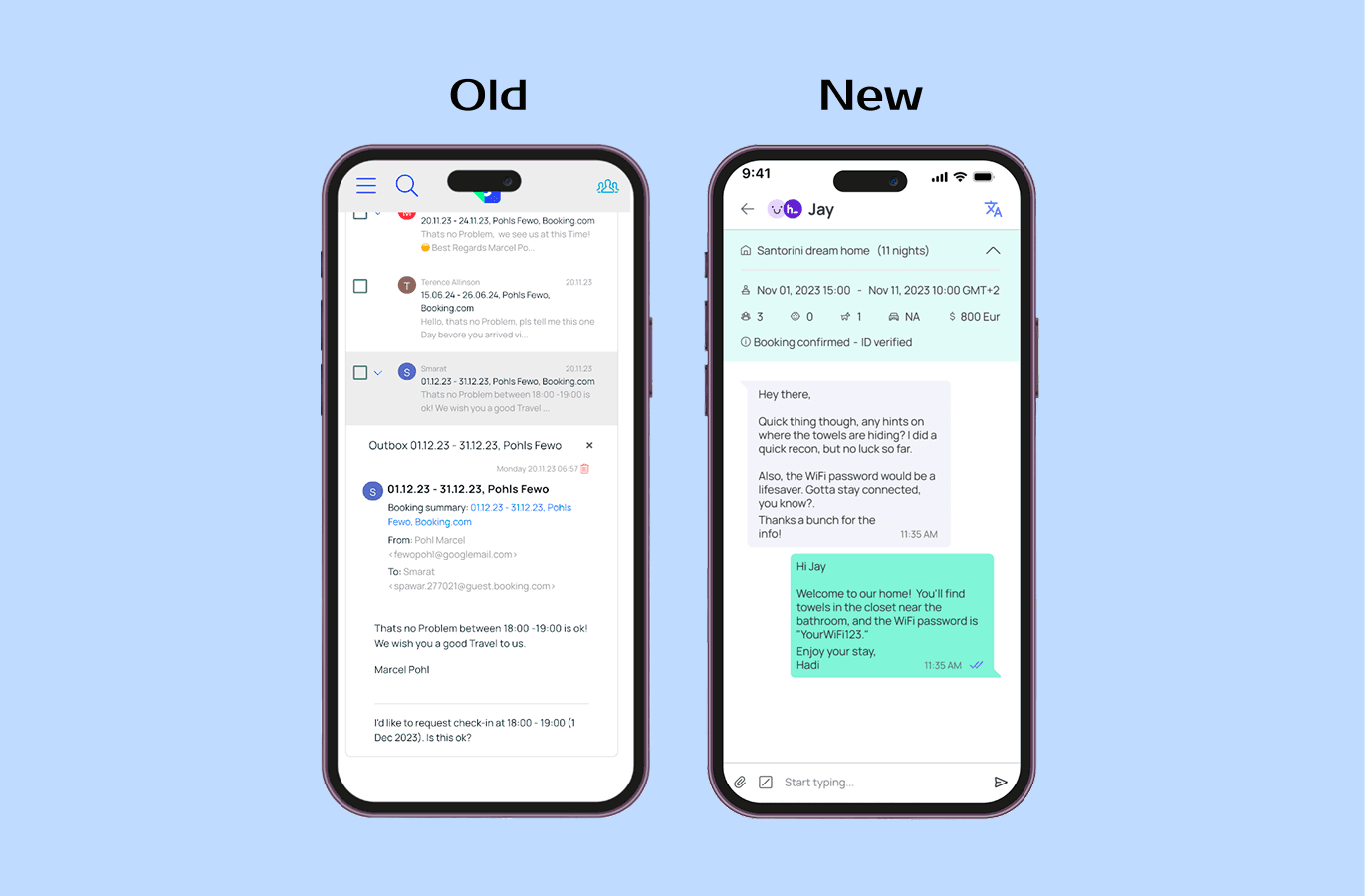
Simplified complex multi-step workflows
Created consistent component library across the platform
Redesigned visual language with clearer hierarchy and iconography
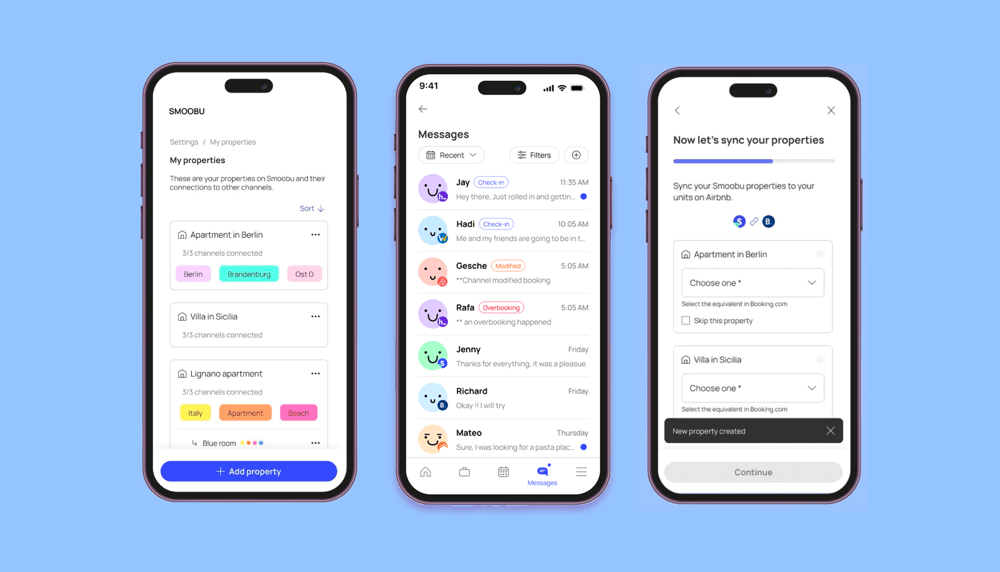
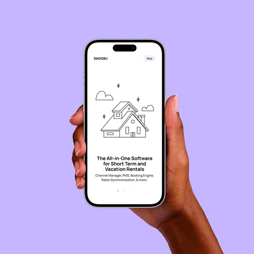
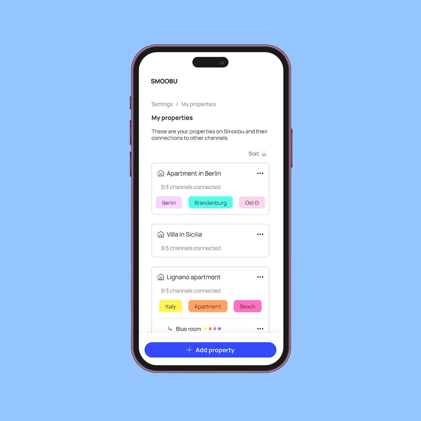
Improved onboarding and property setup flows
Main Tasks
Research
User flow redesign
Design system design
User Flow Simplification
Analyzed user flow structure and prioritized which sections to tackle first by impact
Restructured user flows to streamline navigation and improve task completion efficiency.
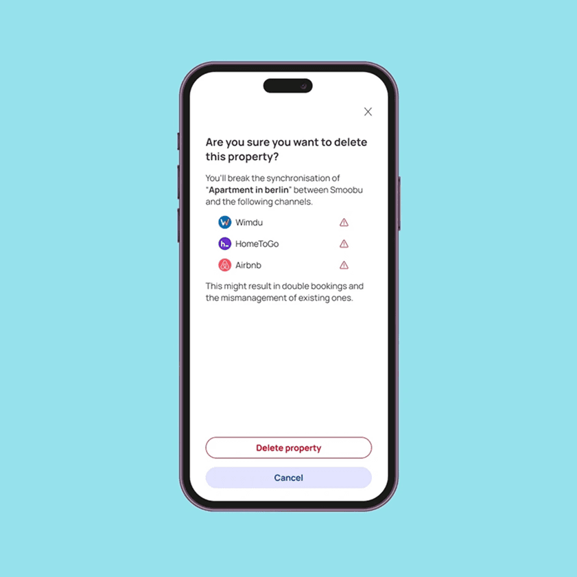
Cognitive Load management
Employed techniques to reduce cognitive overload and ensure users can easily understand and utilize complex features.
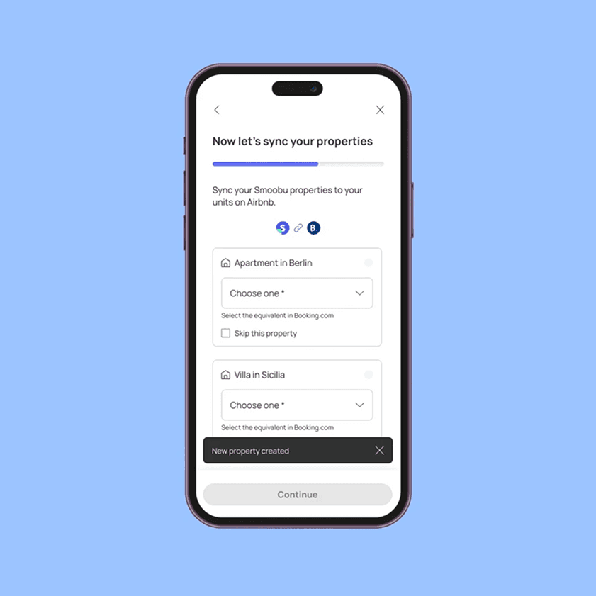
For example: Changing Single-page forms for multi-step flows with clear progress indicators.
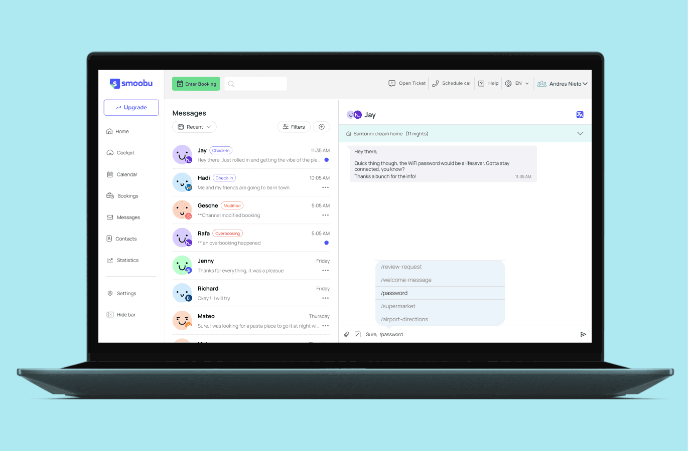
Consistent Components
Similar tasks used different visual patterns across the platform. So we, created a unified component library where similar tasks use similar visual language. This reduced learning curve and created predictable experience.
Added icons to key information to make content more scannable
Empathy-driven Designs
Applied user research insights to empathize with user needs and preferences, resulting in a more tailored and intuitive interface
Results
40% improvement in heuristic evaluation scores
Consistent design language across entire platform
Simplified multi-step processes improved task completion
Positive feedback from design team validation
Key Takeaway
Balancing complexity with usability in B2B SaaS requires systematic thinking. By creating consistent patterns and breaking complex flows into manageable steps, we made powerful features accessible without sacrificing functionality.